

Hummingbird MediSpa Identity
Design / Identity/ Logotype
About this project
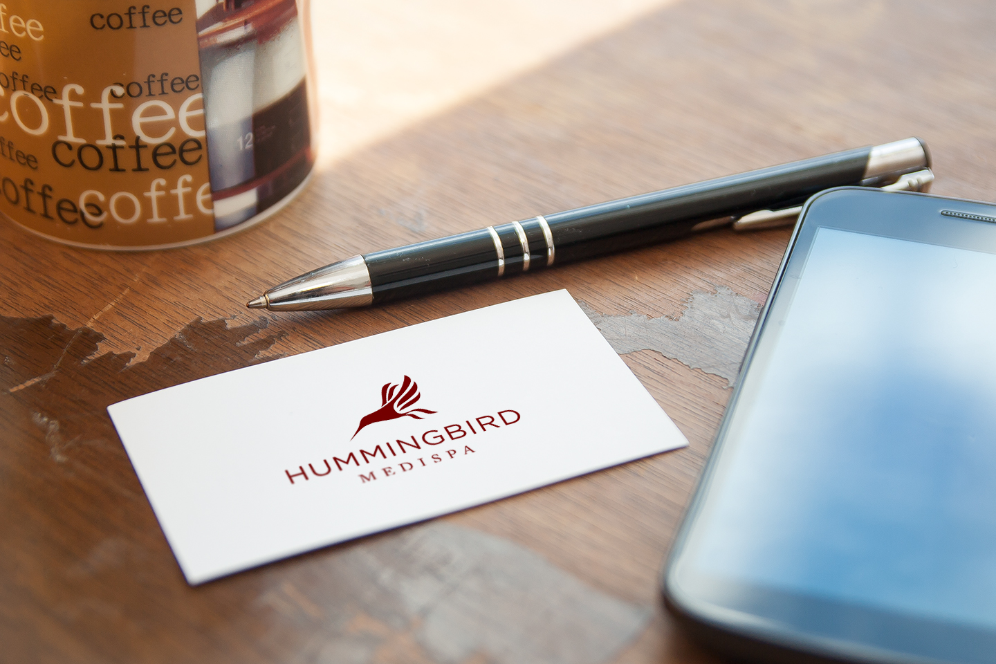
A trip to one of Hummingbird’s spas gives you a good feel for the brand. The spas are well decorated and engaging; elegant and simple. When approaching this identity redesign we made a concious effort to focus on the stylized hummingbird in the existing logo. Preserving that, we did away with the drop shadow to make it cleaner and then searched for a San Serif font (Gotham) as well as a Serif font (Caslon) that could together represent both the clean, minimalist nature of the stores while not losing that regal, elegant feel.
Objectives
- Update the existing brand to be representative of the new ownership and vision for the spa
- develop updated marketing materials and stationary
- work closely with the owners in an advisory position as they transitioned to the new brand

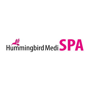
Original logo

New logo